So I’m fairly ticked off. I make a painting, post it on the blog, stick it on Imagekind to sell, all goes well… until I see it on another computer.
Grey mud. Lost my pretty blues and yellows to the ham fisted colour overlord that is Windows.(apparently looks even worse on Mac!) So what happened?
Experienced Graphic Designers will know I fell foul of not setting up my colour space properly. What’s colour space? (did you even ask?) I’ll tell you anyway you poor buggers.
All the devices and software we use use their own set of colours to display an image, some have a wider range than others. So when something is produced in one place it gets reinterpreted when you import it or display it somewhere else. Many things share the same set of colours, but plenty don’t. You can also make a colour profile that travels with the image which smart apps and hardware can use to help get the colour as close to the original as possible. So I really should have been working in my destination colour space. sigh.
So now to a little test. Below is a comparison of the original image, and a new one with the colour space corrected. 
 Now for me the new image is too gaudy in Firefox(the filthy liar), but in dedicated Windows apps it seems to match my Photoshop colours.
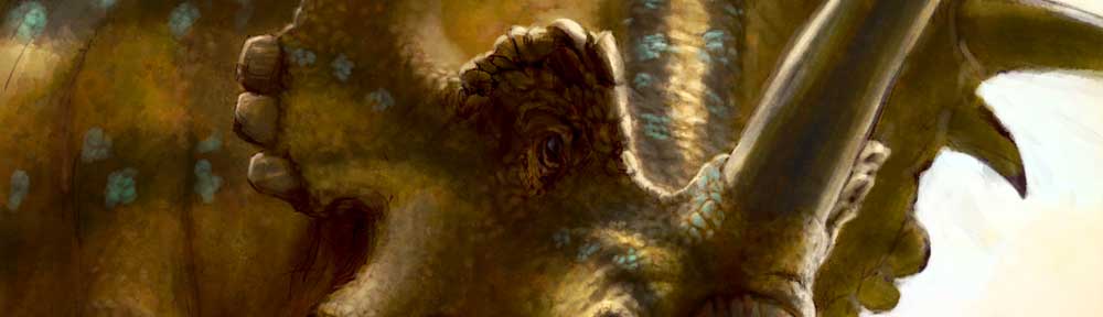
I thought I’d do the usual gif sequence so you can see how disorganised I was as the painting came together, but one step along the way merits a little extra attention..
 Yup, frenzied scribbling!
I’ll often do this trying to get the feel of something without getting stuck doing details. It seems to work for me to get the main masses and directions working, or at least to grab that fleeting picture inside my head and dump it on the page. Anyway, here’s the work in progress animation, enjoy!
Now with working animation!

Yeah color-spaces are annoying. Things get even more complicated when you start dealing with video encoding – ugh.
But dude, your lighting and composition are really nice – and that’s way more important than subtle hue/saturation shifts. I love the angle you chose to depict the attack from – really nice. Like we’re running along side the Tarbo, and we trip just as it lunges! The image we see as our chin slams into the dirt is what you painted. It’s great. Really action-packed!
Thanks Brian.
I’m still wrestling with values, I’ve got a long way to go yet.
Snap! I reckon we’ve both been inspired by Chameleon chin ornamentation?