Sometimes I still paint dinosaurs…

So I’m hardly ever here but it’d still be nice to post every now and again in case anyone out there in the blogosphere is listening… somehow I doubt it! Anyhow, Dave Hone of Archosaur Musings and actual palaeontology asked me to make some artwork to go with his paper with Tom Holtz reviewing Spinosaurs.

Dave wanted something other than spinosaurus, as there was some kind of hooplah about that animal out there on the internets, so I couldn’t use my existing spinosaurus nesting image.

Instead Dave opted for a new image featuring Baryonyx, who apparently doesn’t get enough love. We eventually settled on a couple of Baryonyx doing threat displays, because who can go by a decent threat display? My initial thought was to mimic the actions of seagulls displaying dominance to get the last chip.

Baryonyx_V03

Don’t push me Harrison, in the future this will be a chip!

Just pretend that dead iguanodontid is a chip. I mean, have you seen the donkey on the edge look seagulls get in their eyes when it’s down to that last chip?

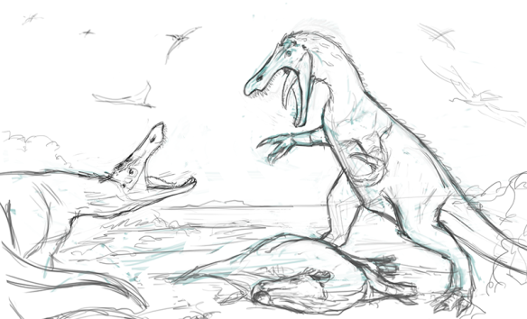
I did some really embarrassing  sketches like the one above, I promise the stealth wing pterosaur scavengers would get refined or painted over in frustration or something.

Eventually I settled on a ‘I’m bored of side on dinosaurs’ view looking right down the barrel. Looking back at this I think I was going to be a lot more daring with the integument. I mean look at all that stuff on the sketch.

Anyhow, here’s the final product which required a bit of 3 dimensional thinking and a lot of reference to get the shapes in the head right! Thanks go to Dave and Tom for giving me the opportunity to make a contribution!
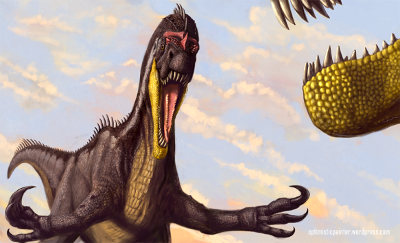
Baryonyx_optimisticpaint

Come at me bro.


A bit of Dreadnoughtus for Stanford University Magazine

In a shock development I’m posting on my blog!

Thought I’d drop a quick dinosaur picture here commissioned by Stanford University Magazine. They approached me asking for a blue whale, a minke whale, a dreadnoughtus and a person for size comparison.

Go read the story about the efficiencies of being a gigantic whale and eating all your meals in a single giant gulp online here!

The large wattle on Dreadnoughtus is very much stolen from the brilliant Brian Enge’s concept of large display features on sauropods.

Meanwhile, here’s my version of the Stanford uni image with ‘enormous aquarium effect’!

DreadnoughtusSort of wondering now if my Dreadnoughtus is a bit on the small side… hmm.

I like your old stuff better than your new stuff #2

Vintage art, circa sometime in the mid 90’s. This is the second version of a piece depicting a predator chasing two Leaellynasaurs across a river. (Acrylic on Board)

The first version had an Abelisaur, back when some research indicated a closer tie between South American and Australian fauna in the Early Cretaceous, until Allosaurus seemed to be a safer bet. Now I’d need to do a version with an Australovenator , feathered of course!

I was already stubbornly feathering my Leaellynasaurs for cold conditions back then, despite no direct evidence of any insulation.

Apologies for the poor photography…Image

Not my best work.. and probably heading upwards of 15 years old! But fun to post during a busy patch.

Bellubrunnus Work in Progress Animation.

Apologies for the lack of updates, I’ve been really busy in the background on various projects. Here’s a work in progress animation of the Bellubrunnus painting.

In retrospect I should have spent more time on the composition, it really could have used another animal in there for example.

Anyway, enjoy another peek at my scattalogical process!

Bellubrunnus: Cute Fuzzy Death from Above

In the midst of painting my first pterosaur for Dave Hone he approached me asking if I could do an ’emergency painting’ for another little critter who’s description was much closer to publication. Bellubrunnus rothgaengeri is a fossil of a juvenile pterosaur closely related to Rhamphorhynchus.

As usual it was hard to say no when Dave showed me the fossil. I’m not at the bleeding edge of pterosaur knowledge but I could recognize several interesting features I couldn’t recall seeing in other animals. The first thing to leap out was the forward curving wing tips, giving the wings quite a different shape from classic pterosaurs. Dave also pointed out that Bellubrunnus had more flexibility in its tail than related species. Be sure to check out Dave’s post on Bellubrunnus at the Musings which I’m sure covers more of the anatomical detail.

So I began sketching away.. actually this sketch was what I sent Dave as a reply when he asked if I wanted the task!

Which he liked. I then made a few more to try out positioning and posture, keeping in mind we needed to clearly show the important anatomical features, the shape of the wing and the flexibility in the tail. I took inspiration from bird photography for the next one.

I really liked it but Dave pulled the whole scientific thing, turns out it was primarily a piscivore(preyed on fish), curse you evidence! I certainly wanted to avoid the old skimming pterosaur trope, and Dave was quite happy with the first gestural sketch I’d done as it showed the features that differentiated Bella from its relatives, so we went with that as a general guide, though we needed to lose the tree as the fossil indicated a coastal habitat.

Fleshing out the initial anatomy went pretty well, though we hit a few snags with the orientation of the fingers and my new favorite body part the ‘uropatagium’. Yup, I spent much time on Skype stuttering trying to pronounce ‘uropatagium’… which is the broad skin between the legs. It’s a bizarre bit of anatomy that attaches to the outside toes which then fold back over the sole of the foot.

Anyway, after much too-ing and fro-ing we got the anatomy in a happy place and I could render it all up. Here’s the final piece.(click to embiggen)

I did joke that I was incapable of producing a painting without an approaching storm in the background.. seems to be holding true for now!

Ray Bradbury passes…

Ray Bradbury, one of the ‘old men of Science Fiction’ has passed away at the age of 91.

Bradbury wrote in the era when ideas we consider tropes now were, well, ideas. When they thought there may be canals on Mars, before man had been to the moon. It was a golden age of science fiction writing.

When I was in my early teens I discovered a pile of old Science Fiction short story compilations in the shed. My Dad had read them back in the 70’s, but they were really stories from as early as the 40’s.

Bradbury was among them, telling stories with the twists so common to the form, but tying it in with heart, thoughtfulness and sentiment. His prose was almost poetic even while he built tension in stories like ‘The Fog Horn’, or bordered on the theological in ‘The Traveler’. My favourite by far though, and my favourite short story of any author is ‘A Sound of Thunder’.

Bradbury’s tale of vainglorious hunters going back in time to hunt a Tyrannosaurus and unwittingly affecting their future would, if published today, be considered a rehash, a cliche. Except Bradbury did it with such class, subtlety and so perfectly for the short story form, to me everything since seems trite.

In 1983 Bantam Books published ‘Dinosaur Tales’, an illustrated collection of Bradbury’s short stories about dinosaurs. Among them was ‘”Besides A Dinosaur, Whatta Ya Wanna Be When You Grow Up?“(alarmed grandfather looks for a substitute obsession when his grandson begins sharpening his teeth), “The Fog Horn“(a terrifying and mournful romance between a lighthouse and….. something ancient) and “A Sound of Thunder”.

And so came together my favourite short story, and my favourite illustrator, William Stout, who had provided the beautiful drawings to accompany the story. There’s little I can say about how much this double whammy affected me as a developing artist, except perhaps that one day I still want to make a short film that’s entirely true to the story and illustrations in that book. I’ve posted a couple of illustrations from the book below, both are by William Stout.

Yutyrannus, Metyrannus, We all Tyrannus….

Since the description of everyone’s new favourite tyrannosaur Yutyrannus, there’s been an absolute glut of depictions by anyone who can hold a pencil in the paleo illustration community.

And why not? A 6 meter long tyrannosaur with fluffy feathers! It’s weird and cool and just ever so disturbing in equal measure, a bit like like Yo Gabba Gabba.

Image

Not wanting to join in the frenzy I thought I’d take another tack and take a serious and in depth look at what this discovery means for anatomists, palaeontographical illustrators and nerds who like to draw dinosaurs..

Image

Spinosaurus Mum takes a break..

Well, I couldn’t leave well enough alone and kept throwing more time and energy into the Spinosaurus sketch! In some ways it touches back to the first paleo gig I did a few years ago for Tor Bertin who was reviewing Spinosaur material.

Back then I’d hoped to paint the living animal, but had to satisfied with doing some studies of the jaws instead.(I still had more fun than any sane person should have)

Recently inspired by the skeletal reconstruction by Scott Hartman with Andre Cau and Jamie Headden I thought I’d have a stab at painting the new look properly.

Hopefully I did the guys’ hard work some service, the new sail extends much further down the tail. The pose has no scientific verification, though I did opt for something different than the usual explosive action poses we usually find Spinosaurus in.(at least it isn’t beating up Tyrannosaurus!)

What can I say? It’s a mum, eating a snack on her break. With a cheeky Ornithocheirid pterosaur waiting for some scraps. You might have noticed the little guy has changed since the last post, well, I discovered there wasn’t really a way for it to be clinging on with the wings in that position. Here’s a before and after…

Listen to the Impartial…

A while back I pointed out the importance of listening to the scientist when making scientific illustration, they know their stuff, it’s their job. It’s also important to listen to a trusted friend or two, someone who brings a fresh pair of eyes, preferably they haven’t had contact with the artwork before.. You may not always like what they have to say, but if you’re making visual communication like art or illustration then having a small sample audience can give you an idea if your message is getting across. It’ll become clear very quickly when something doesn’t ‘read right’.

One of the benefits of marriage is you get a convenient audience/viewer/victim to show artwork to. I’m lucky in that Sanja, though now the best book keeper in Tasmania, used to do a fair bit of art herself. I’m also lucky that when it comes to saying stuff about my work, Sanja will just come out with something that strikes her as wrong, usually starting tactfully with “Is that supposed to be…”.

At that point I’ll usually roll my eyes in exasperation, knowing that Sanja has pointed out a critical aspect of the work that I’ve overlooked, knew I could have done better or just plain fluffed.

So with Sanja’s comment on my last post in mind I’ve adjusted the sail on the Spinosaur, which I knew wasn’t right but needed that impartial eye to sort drive it home. Here’s a little update to show the new angle, with the ‘undercoat’ exposed to see just how much the thing has shifted!

For those without a trusted feedback person, you can go far doing a few tricks that allow you to see your work in a different light.

Horizontal Flipping of the image often fools the brain into thinking it’s seeing something new. In software this is pretty easy, in the real world use a mirror to view your artwork(an old trick). It’s pretty amazing how composition issues suddenly appear!

Desaturation really helps sort out your values. I use an adjustment layer in Photoshop which I can just turn on and off to see a black and white version of my painting so I can make sure I’m using a full range of values.

The Old Squint Test, yup, narrow your eyes and look through your lashes. This obscures detail and makes the values and composition much more important to reading the image.

Take a step back. Yep, you can literally and figuratively get too close to what you’re doing. Getting stuck into the rewarding stuff like detail too early can lead to overlooking your main masses, values and composition. In software zoom out and make the image a thumbnail. Does it still ‘read’ well? Zooming out of the image allows you to assess perspective more effectively too.

Even better, take a step away from your monitor/canvas/paper, walk around the room, have a 30 minute break and come back. Does the image still work?

Experienced visual communicators will be pretty familiar with these techniques, and likely have even more to draw upon. Check out David Maas’ blog for a look at how a real pro dismembers an artwork in truly analytical fashion.

Now I just need a palaeontologist to come along and tell me the spine didn’t have that much flexibility…..