A while back I pointed out the importance of listening to the scientist when making scientific illustration, they know their stuff, it’s their job. It’s also important to listen to a trusted friend or two, someone who brings a fresh pair of eyes, preferably they haven’t had contact with the artwork before.. You may not always like what they have to say, but if you’re making visual communication like art or illustration then having a small sample audience can give you an idea if your message is getting across. It’ll become clear very quickly when something doesn’t ‘read right’.
One of the benefits of marriage is you get a convenient audience/viewer/victim to show artwork to. I’m lucky in that Sanja, though now the best book keeper in Tasmania, used to do a fair bit of art herself. I’m also lucky that when it comes to saying stuff about my work, Sanja will just come out with something that strikes her as wrong, usually starting tactfully with “Is that supposed to be…”.
At that point I’ll usually roll my eyes in exasperation, knowing that Sanja has pointed out a critical aspect of the work that I’ve overlooked, knew I could have done better or just plain fluffed.
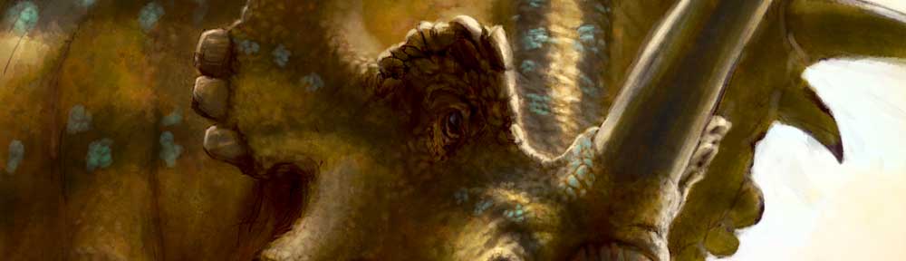
So with Sanja’s comment on my last post in mind I’ve adjusted the sail on the Spinosaur, which I knew wasn’t right but needed that impartial eye to sort drive it home. Here’s a little update to show the new angle, with the ‘undercoat’ exposed to see just how much the thing has shifted!
 For those without a trusted feedback person, you can go far doing a few tricks that allow you to see your work in a different light.
Horizontal Flipping of the image often fools the brain into thinking it’s seeing something new. In software this is pretty easy, in the real world use a mirror to view your artwork(an old trick). It’s pretty amazing how composition issues suddenly appear!
Desaturation really helps sort out your values. I use an adjustment layer in Photoshop which I can just turn on and off to see a black and white version of my painting so I can make sure I’m using a full range of values.
The Old Squint Test, yup, narrow your eyes and look through your lashes. This obscures detail and makes the values and composition much more important to reading the image.
Take a step back. Yep, you can literally and figuratively get too close to what you’re doing. Getting stuck into the rewarding stuff like detail too early can lead to overlooking your main masses, values and composition. In software zoom out and make the image a thumbnail. Does it still ‘read’ well? Zooming out of the image allows you to assess perspective more effectively too.
Even better, take a step away from your monitor/canvas/paper, walk around the room, have a 30 minute break and come back. Does the image still work?
Experienced visual communicators will be pretty familiar with these techniques, and likely have even more to draw upon. Check out David Maas’ blog for a look at how a real pro dismembers an artwork in truly analytical fashion.
Now I just need a palaeontologist to come along and tell me the spine didn’t have that much flexibility…..